
Seeing how crucial public transport is to the people who don’t drive and for protecting the environment, public transport needs to be in its best shape to move passengers conveniently, especially with the numerous possibilities big data brings to public transport performance.
One aspect of public transport performance is occupancy data, which is essentially people counting data. Occupancy data has a huge role to play in informing passengers about the congestion levels in trains and buses to help them avoid crowded vehicles.
To get started with using people counting data, we had to familiarise ourselves with the data set we received by exploring it. Here’s how we explored people counting data in public transport.
Note: Line names have been changed to random numbers for anonymity.
Importing the people counting data
Using Python, we imported Pandas and Numpy for analysing and computing our people counting data sets, as well as Matplotlib and Seaborn for visualising the computed data.
We then assigned the variable of the chosen date-time dataset of 28th February 2020 as “begin_of_corona”. It goes without saying that the date-time of 28th February 2020 was roughly when the Covid-19 pandemic started making its entrance into our lives.
# Python Configuration
%matplotlib inline
import pandas as pd
import matplotlib.pyplot as plt
import seaborn as sns
import numpy as np
from datetime import datetime
begin_of_corona = datetime(2020, 2, 28)
Calculating and visualising the ratio of counted trips to all trips
The ratio of counted trips to all trips offered a clue as to whether routes were regularly counted.
The calculation for this ratio used a comma-separated values (CSV) file about the trip schedule from the Pandas library, so the file was assigned as “trip_schedule”, which was an export of the MaBinso software.
The CSV file was the basis for a pie chart we baked made to show the proportions of the following elements:
- 0 – uncounted
- 1 – counted
- 2 – extrapolation
- 3 – replacement value
trip_schedule = pd.read_csv('trip_schedule.csv',';',low_memory=False)

labels = '0 - uncounted', '1 - counted', '2 - extrapolation', '3 - replacement value'
sizes = [866868/len(trip_schedule), 434581/len(trip_schedule), 569414/len(trip_schedule), 177620/len(trip_schedule)]
# only "explode" the 2nd slice (i.e. 'counted')
explode = (0, 0.1, 0, 0)

fig1, ax1 = plt.subplots()
ax1.pie(sizes,
explode=explode,
labels=labels,
autopct='%1.1f%%',
shadow=True,
startangle=90,
radius=1.9)

plt.show()
We designed the pie chart by using Matplotlib’s Pyplot “plt.subplots()” function which was assigned to “ax1” and “.pie” to plot the pie chart while incorporating:
- the labels of the elements for identification to assist our interpretation
- their ratios (by calculating their sizes with respect to the total) and their percentage displays using “autopct”
- how the “counted” slice stands out using “explode” since we wanted to know about counted trips
- a counterclockwise rotation of 90 degrees to prioritise the uncounted and counted trips
- radius of 1.9 to fit everything nicely and clearly
- a shadow effect for further clarity
With the design code assigned, we then used Matplotlib’s Pyplot “plt.show()” function to plot the final result for our interpretation.
Interpreting the pie chart of all trips
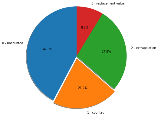
Looking at the pie chart, it sadly didn’t help that only 21.2% of all trips in the data were counted. Why did the counted data make up such a small proportion of the overall data?
One possibility for the lower amount of counted data was that the data cleaning process may have gone beyond removing duplicates. Maybe the data engineer got carried away with the decluttering or made some human errors.
Another possibility for this issue was that since manual counting was involved, the manual counts were stopped after a certain point. Simultaneously, there were not enough automatic people counting systems to make up for this. The shortage of manual and automatic counts was more likely to influence the results than the overcleaning of data.
But a more likely possibility to consider was that the data was gathered around the time Covid-19 began making headlines and full lockdowns were enforced worldwide shortly after. This could simply mean that no data was gathered during the first full lockdown.
Was there something that could have been done better? Perhaps, public transport data collectors should establish that the show must go on, rain or sunshine. In more direct words, public transport data collection should be done consistently regardless of whether passengers will be absent or present.
Without doing so, we may have missed out on seeing the actual implication of the lockdown on the occupancy level. Who knows? There could have been a few frontliners who still needed to use the train or bus unless the public transport operators were instructed to put their services on hold during the lockdown.
Calculating and visualising the ratio of counted trips per line
This ratio was also a ratio of counted trips to all trips but for each line. So, for this calculation, we focused on just 2 columns by setting them as “valid_columns”: APC and Line.
APC stands for “automated people counting“.
We indexed the “valid_columns” using square brackets in the trip_schedule CSV file that we used for our pie chart earlier. Along with this indexing, we used a few functions:
- “groupby()” to split the tabular APC data according to the lines in the Line column for plotting the barplot
- “count()” to count the data for each line in the Line column
- “to_frame()” to convert the counted APC data to a dataframe “c”
- “reset_index()” to reset index of “c” to default indexing
- “sort_values(by=’c’,ascending=False)” to arrange the lines from the highest “c” values to the lowest “c” values
We then assigned this whole thing to “lines”.
valid_columns = ["apc", "line"]
lines = trip_schedule[valid_columns].groupby(by=["line", "apc"]).line.count().to_frame('c').reset_index().sort_values(by='c',ascending=False)

plt.figure(figsize=(23, 9))
sns.set_style("white")
sns.set_context("notebook", font_scale=1, rc={"lines.linewidth": 2.5})
ax = sns.barplot(data=lines[:120], x='line', y='c', hue='apc')
_ = plt.xticks(rotation=90)
plt.legend(loc='upper right')
We used “plt.figure(figsize=(width, height))” to create the figure object and tweak its size to the desired width and height to fit all the lines on the x-axis of the barplot. We then used Seaborn accordingly:
- Set style to “white” instead of the default style using ‘set_style(“white”)’.
- Set the parameters that control the scaling of plot elements using “set_context()”.
- Plotted the barplot with Lines on the x-axis and “c” on the y-axis, assigning the plotting to “ax”. Hue indicates whether the bars show APC data or otherwise. True for APC is coloured orange, meaning automated people counting. False for APC is coloured blue, meaning manual people counting.
- Customisation of the figure involved setting the line labels on the x-axis at a 90-degree angle so that they stand straight and positioning the legend to the upper right corner of the barplot.
Since the lines were arranged from the highest “c” values to the lowest “c” values earlier, the barplot appeared like a descending mountain of sticks.
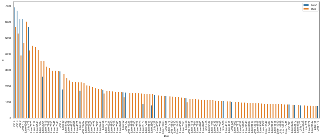
Interpreting the barplot of counted trips ratio per line
From interpreting the barplot, there are many things to question about this analysis such as:
- Which automatic people counting method was used? Different people counting methods have different levels of accuracy, so knowing the people counting method used can give us clues about the data’s reliability.
- Was there any counting error? Why did some lines have discrepancies between auto counts and manual counts? Again, this brings us back to knowing the people counting method used as certain methods like facial recognition wouldn’t mistake large items as passengers or repeating counts of the same passenger.
- Why were there very few manually counted lines out of all lines in our sample? This could tell us whether there’s any point in manual counting if most lines didn’t do so.
- How was the data cleaned? We need to know the data cleaning process because there’s a possibility that the data was overcleaned which may have impacted the manual counting data.
- Were some lines not counted? Were there time breaks in the counting? Did we miss any line in our sample? Or was the data for these lines unavailable? We need to consider the possible reasons for why some lines had no bars in the barplot.
- How often was a line counted? Were some lines counted more than others? At which times of the day were the lines counted? Were the timings consistent? We need to consider whether more frequently counted lines were aggregated to show that they have higher occupancy levels.
- Where are the lines with higher counts located? Where are the lines with lower counts located? The occupancy levels could indicate the locations of the lines and whether the locations are higher or lower in demand.
- Knowing that lines are manmade, what were the public transport planners considering when they proposed the lines if not route optimisation and demand? Maybe it’s the geospatial features of a location.
- Was there a better way to visualise this? Maybe the visualisation of choice wasn’t representing the data in the optimal way. It’s possible that this barplot missed out some additional insights.
Such questions can help determine the next steps of the data exploration.
Calculating and visualising the counted trips ratio per line timeline
We also visualised the timeline over which the lines were counted using a scatterplot. The aim of the scatterplot was to show when the lines were counted and not counted.
plt.figure(figsize=(23, 9))
_ = plt.title(f'Lines to Counted Trips')
sns.scatterplot(data=learning_data, x="timestamp", y="line")

<AxesSubplot:title={'center':'Lines to Counted Trips'}, xlabel='timestamp', ylabel='line'>
We again created the figure object, tweaked its size and used Seaborn to plot the scatterplot with the timestamps on the x-axis and the lines on the y-axis.
The “<AxesSubplot…>” part was for positioning the title “Lines to Counted Trips” in the top centre while setting the x-axis label as “timestamp” and the y-axis label as “line” (as you can see in the image below).
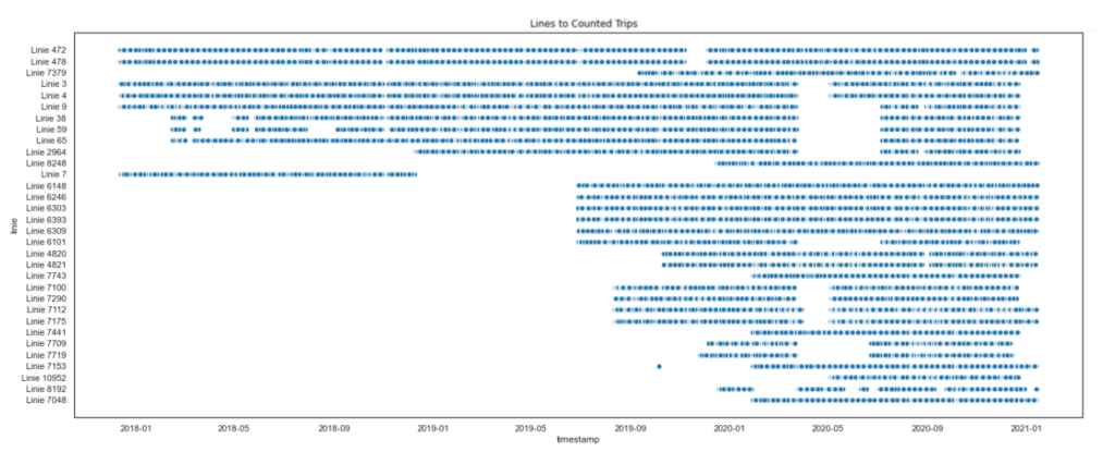
Interpreting the timeline scatterplot
While the coding approach used the entire time may have room for discussion, I don’t see how the code matters more than the quality of the data set itself, which can be seen in the scatterplot.
The gaps shown in this scatterplot brings us back to the issue of inconsistent data collection (but in more detail), which is the foundation of this data exploration. So, there’s no point in talking about the rest of the steps taken in any data exploration project if the data set we rely on is poor.
For some of the lines, the Covid-19 pandemic onset could be the best possible explanation. But this scatterplot has also revealed that most of the lines didn’t have people counting data before mid-2019. There are two possible factors:
- They didn’t start counting (or install people counters) until mid-2019.
- Data before mid-2019 couldn’t be accessed.
Another strange thing to note from this scatterplot is that Line 7 only showed a year’s worth of people counting data, between early 2018 and early 2019. What happened to Line 7 after that?
Not to forget, the whole timeline started from early 2018, which leads me to wonder if people counting data has been collected before 2018 or not.
What our first people counting data exploration told us
We started by importing the relevant libraries for us to analyse, compute and visualise the people counting data. We then proceeded to calculate the ratios of counted trips to all trips and the same ratio for each line, which have been visualised by a pie chart and a barplot respectively. A timeline of the latter ratio was also visualised using a scatterplot.
In the process, we learnt (or rather, were reminded of) the importance of data quality in any data investigation and that public transport data collection should be done consistently regardless of whether passengers will be absent or present.
At the same time, the questions we generated from interpreting the barplot suggested other things to explore about the data. These interpretations inform our next steps for this data exploration, which will be explained via heatmaps in the next article.