
How long or often does each passenger ride a line or one section of a line? Where does a passenger get in and out?
What a public transport line means to a passenger
Where a passenger gets in and out as well as the length of time and frequency of riding a particular part of a route must be a reflection of how much that line means to the passenger.
If we can see that a passenger is using the same line every weekday back and forth, we can then conclude that the line makes up a very important part of the passenger’s daily commute.
Such value is amplified for people who don’t drive. But, if we can see that a passenger is using a line once in a while or just once, then we can conclude that the line is not as important as a daily commute line.
On the whole, why should we know the value of a public transport line per passenger?
- Ticket revenue sharing: Due to the presence of different operators in an integrated transport system, we need to know how much ticket revenue should be distributed to the operators of the lines used by the passengers.
- Demand-driven transport planning and optimisation: We need to gauge the demand of a route or line to make decisions about the route design and also find out whether something is discouraging or encouraging passengers from using an alternative line.
- Service expansion during the Covid-19 pandemic: Knowing the demand also informs social distancing measures via service expansion for higher demand lines.
How can we analyse the value of each line?
The first step to analysing the value of each line is using people counting methods to detect where passengers board and alight. Below are some examples:
- Hidayat, Terabe and Yaginuma (2020) were Estimating bus passenger volume based on a Wi-Fi scanner survey, whereby they used a Wi-Fi scanner to send probe requests to individual bus passengers’ mobile devices to detect their media access control (MAC) addresses. They then cross-checked the Wi-Fi data with ground truth data and concluded that their Wi-Fi scanning approach can produce passenger volumes for several bus route lines.
- Nitti et al (2020) put forward iABACUS: A Wi-Fi-Based Automatic Bus Passenger Counting System via in-built sensors on public transport vehicles to track the flows of passengers in and out of the vehicles. They found that iABACUS can count the number of Wi-Fi active mobile devices, with a 100% static accuracy and nearly 94% dynamic accuracy.
- Sánchez del Río et al (2016) proposed Automated border control (ABC) e-gates and facial recognition systems to handle e-gate congestion, arrival delays and so on resulting from a boom in passenger numbers. It’s noted that the facial recognition system at the ABC e-gates should be invariant to non-idealities like changes in poses, expressions and lighting in order for the system to be accurate and efficient. It’s also noted the most optimal type of illumination (halogen, white LEDs, infra-red or fluorescence light) should be used at the ABC e-gates to help the facial recognition system.
- Arnone et al (2016) presented The Potential of E-ticketing for Public Transport Planning: The Piedmont Region (Italy) Case Study to prove how the data produced by the smart card-based e-ticketing system, BIP, can be used to analyse each passenger’s digital travel journal, i.e., trip chains, origins and destinations. The data can then be used to calculate the time and space distributions, origin-destination matrices and performance indicators of each passenger trip.
- An old-fashioned survey collection approach was used in The Study on Development of Regional Railway System of Central Java Region Final Report to gather insights on the usage of transport modes in Central Java.
- The counting data can be coupled with artificial intelligence (AI) to estimate the demand for a route section or line based on the usage level. An example of this is Dubai’s Road and Transport Authority’s (RTA) initiative to pair smart card data with machine learning algorithms to map out bus routes.
To visualise the obtained data of where passengers board and alight and how many, Sankey diagrams (reportedly named after Captain Sankey) can then be used. A Sankey diagram is defined in multiple ways, so I’ll leave it to the sources to do the descriptions below:
“A Sankey diagram is a visualization used to depict a flow from one set of values to another. The things being connected are called nodes and the connections are called links. Sankeys are best used when you want to show a many-to-many mapping between two domains (e.g., universities and majors) or multiple paths through a set of stages (for instance, Google Analytics uses Sankeys to show how traffic flows from pages to other pages on your web site).”
Google Developers’s definition of a Sankey diagram
“Sankey diagrams feature directed arrows that have a width proportional to the flow quantity visualized: if a flow is twice as wide it represents double the quantity. Flow diagrams can show e.g. energy, materials, water or costs. Within a Sankey diagram, the directed flow is always drawn between at least two nodes (processes). Thus it shows not only flow values but also information about the structure and distribution of the defined system. So they are a great alternative to common flow or bar & pie charts.”
iPoint’s definition of a Sankey diagram
“A Sankey diagram depicts flows of any kind, where the width of each flow pictured is based on its quantity. Sankey diagrams are very good at showing particular kinds of complex information: Where the money came from & went to (budgets, contributions); Flows of energy from source to destination; Flows of goods from place to place; And potentially many more.”
SankeyMATIC’s definition of a Sankey diagram
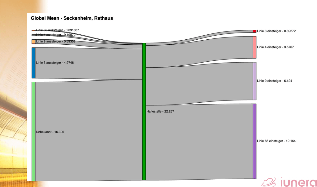
Although it wasn’t mentioned in the definitions, Sankey diagrams can luckily be applied to visualising the entries and exits of passengers at a particular time period of the day. Accompanied by legends and labels, the stops can be denoted by the nodes while the lines can be denoted by the links. Different colours can be used to distinguish the entries, exits, lines and stops.
The value in finding out a passenger’s line value
The importance of line value analysis can’t be emphasised enough. Knowing the entry and exit stops, length of commute time and frequency of commute on a particular line helps determine how the routes should be designed and expanded according to demand. It’s also important for determining how much revenue each operator in an integrated multimodal transport system should get.
Thankfully, there are various options of people counting methods like Wi-Fi signals, facial recognition tech, concrete coins records, ID-based check-ins, et cetera that can be used to collect the data of detected entries and exits needed for line value analysis. But analysing line value would be pointless without the visualisation to do the showing and the Sankey diagram seems to be the best actor for the role of line value visualisation.
Taking into consideration the relationship between the flow quantity and the width of the Sankey arrows, a Sankey diagram for a particular line can depict the flows of passengers entering via their departure stops and exiting via destination stops at a particular time of the day. Such straightforward visualisation is thus helpful for demand-driven route planning, service expansion and ticket revenue sharing.
Related Posts
The Ultimate Guide To The Demand For Public Transport Routes
The Various People Counting Methods In Public Transport
Public Transport Occupancy Data For Social Distancing