
Introduction
The term solar energy should be quite common; it represents the direct energy produced by sunlight.
Using certain hardware such as solar panels and electrical converters, the radiation from the sun can be converted to electricity.
In reality, solar energy serves as one of the most important and accessible renewable energy sources on Earth.
According to International Renewable Energy Agency (IRENA).
Global solar power capacity will grow by 9% every year between 2018 and 2050,
and
Future of Solar Photovoltaic created a study that states the solar capacity around the Earth will increase from 480GW in 2018 to over 8,000GW by 2050. Other important key findings of solar energy can be taken from this link.
Solar energy is beneficial if countries with more than enough direct solar radiation take advantage of this to harvest the radiation and produce electricity in a greener manner.
In this article, we will analyse a dataset of solar energy collected from multiple cities in Pakistan. Pakistan has a huge potential for solar-powered electricity generation. The country is most receiving direct sunlight throughout the year.
Take a look at the image snippet below from a research paper by Sophia Akhtar:
Hence, this would be a good start to analyse the solar radiation data from certain cities in Pakistan.
What We Will Be Doing
This article will go through setting up the notebook for analysis and some initial exploration using the data. We will download the data, make sense of the columns, and perform some data grouping to obtain an overall picture of the available data.
Once that is done, we will then move on to a more detailed analysis with visualizations and exploration.
Prerequisites
There are some prerequisites if one would like to follow the steps in the article since it involves some basic Python coding. Below are the software needed and the relevant links to install them.
Python: https://www.python.org/downloads/release/python-395/
Jupyter Notebook: https://jupyter.org/install (We can use Zepellin as well)
Pandas: https://pandas.pydata.org/
Numpy: https://numpy.org/
Matplotlib: https://matplotlib.org/
Zeppelin: https://zeppelin.apache.org/
Once set up, we can move on to download the data.
Dataset
The datasets can be obtained from this link. This article will explore the solar data in Islamabad, Karachi, Peshawar, and many other cities as a start. These are the cities in Pakistan with an open data source related to solar energy in a given time period.
This dataset is collected by the Government of Pakistan, together with NREL and USAID, which produces daily reports on mean values for solar radiation, air temperature, air pressure, wind speed and other metrics in which we will explore in this article.
Obtaining the Data
Downloading
This section will explicitly download the datasets from the linked sources and combine them into a single table.
We will be exploring particularly 2 cities in Pakistan, Hyderabad and Islamabad and their solar energy data in this article.
1. Let us download a single CSV file from this link. We can download them using wget or just manual download. Once done, we can read the CSV file as below:
import pandas as pd
df = pd.read_csv('solar-measurementspakistanhyderabadwb-esmapqc.csv')
2. Now, let us take a look at what the columns mean in the CSV file as below:
| Column | Details |
| time | Date and time (yyyy-mm-dd HH:MM) |
| ghi_pyr | Global horizontal irradiance (W/m²) from thermopile pyranometer |
| ghi_rsi | Global horizontal irradiance (W/m²) from Rotating Shadowband Irradiometer |
| dni | Direct normal irradiance (W/m²) from thermopile pyrheliometer |
| dhi | Diffused horizontal irradiance (W/m²) from thermopile pyranometer |
| air_temperature | Air temperature (°C) |
| relative_humidity | Relative humidity (%) |
| wind_speed | Wind speed (m/s) |
| wind_speed_of_gust | Maximum wind speed |
| wind_from_direction_st_dev | The wind direction in degrees north counted clockwise (standard deviation) |
| wind_from_direction | The wind direction in degrees north counted clockwise |
| barometric_pressure | Ambient air pressure in Pa |
| sensor_cleaning | 1 (yes) / 0 (no) |
Before we get into the details of the table, let us try to understand what the table contains.
- ghi_pyr stands for Global horizontal irradiance (W/m²) from thermopile pyranometer. Global Horizontal Irradiance stands for the amount of radiation that is obtained by the thermopile pyranometer by a reflective surface that is horizontal to the ground. A thermophile pyranometer is a device that is commonly used to measure solar radiation. The unit for this measurement is W/m² as it represents the amount of power (W) received in an area (m²)
- ghi_rsi is quite similar to the ghi_pyr but instead of a thermophile pyranometer, it has a Rotating Shadowband Radionometer (RSR2) which basically collect solar radiation over a certain rotation.
- dni stands for Direct normal irradiance, which represents the solar radiation received per unit area by a surface that is captured perpendicularly. We can use this metrics to track the position or the angle of the maximum solar radiation received.
- dhi is quite similar just that the radiation that is received does not has to be perpendicular to the surface of the measurement tool.
Combining Multiple Datasets
Let us try to combine all the cities into a single table:
We can do this by reading the files and converting them into a single Pandas Dataframe. Once that is done, we can combine all the city tables into a single table, as shown below.
By looking at the bar plot of the table, we can see the total number of rows of each city as shown below:
Let us move to the Data Analysis part, where we will analyse and understand every important data domain to get a clearer picture.
Data Analysis
Data Cleaning
Data cleaning represents one of the most important aspects when it comes to analysis. Is it a must to clean the data? Well, it depends on the data itself. Let us take a look.
Let us first analyse the percentages of missing values in each column using a simple bar chart as shown below:
From the first glance, it seems like the columns comments and ghi_rsi has the most missing values. To impute these missing values, let us understand the column.
Let us take a look at the data contained in the column comments represent the non-NAN values:
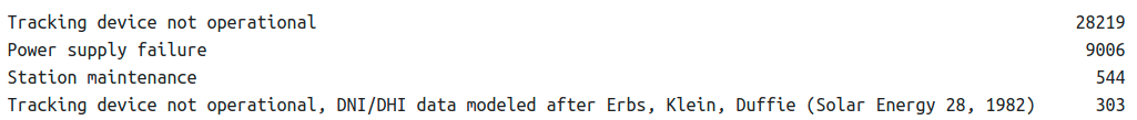
Let us take a look at the rows of data with the comments: ‘Tracking device not operational‘
All the dhi and dni values have no values in them. We do have other numerical values so will keep this for now.
Let us take a look at the rows of data with the comments: ‘Power supply failure‘
Further on, we will look into the rules of these NaN columns and come up with an explanation on what to decide with this data.
As for the ghi_rsi, we will not perform any decision until we explore this data further in the coming sections.
Column Analysis
Let us first try to understand what each of the values in the column really means. For this, we will try to plot the spread of the column for a single day and explain the behaviour of the data.
Let us take a look in particular 5 important columns and explain the distribution of the data containing them.
Air Temperature (C)
Details: The air temperature columns refer to the temperature from 00:00 to 24:00 in a single day.
Explanation: The graph above shows that the lowest air temperature is around 26C, from around 05:00 to 06:00. The air temperature peaks at around 14:00 to 16:00, with a maximum temperature at around 43C.
We can also observe that right after sunrise; the air temperature rise is the fastest. Also, when it is around 1 hour nearing the sunset, the air temperature drops the fastest. The peak value happens at noon. The maximum and minimum temperatures might vary between different cities and different weather conditions.
Relative Humidity of Air (RH)
Details: The relative air humidity column refers to the relative humidity from 00:00 to 24:00 in a single day.
Explanation: It can be seen from the graph above, the relative air humidity level is the highest during sunrise, which is around 05:00 and the lowest at noon, where the air temperature is the highest.
The relative air humidity represents the measurement of water vapour in percentage, but is it relative to the temperature of the air. Hence, that is why we observe an opposite trend between air temperature and relative air humidity.
Global Horizontal Irradiance (GHI)
Details: The GHI column refers to the global horizontal irradiation in a single day that is collected by a tracking device.
Explanation: Global Horizontal Irradiance stands for the amount of solar radiation that is obtained that is horizontal to the ground. Because ground-reflected radiation is usually insignificant in most practical cases, it represents the sum of the Direct Normal Irradiance (DNI) and Diffuse Horizontal Irradiance (DHI).
Explanation: When we compare the GHI on 2 different days, we can see that the weather of the day through the variation of the GHI reading.
A clear sky will have unobstructed radiation that will be collected by the device, which is shown in the first chart.
In the second chart, however, there was some form of obstruction that caused the solar radiation to be less in certain hours.
Direct Normal Irradiance (DNI)
Details: The DNI column refers to the direct normal irradiation in a single day that is collected by a tracking device.
Explanation: Direct Normal Irradiance stands for the amount of solar radiation that is obtained that is normal to the ground. Being quite similar to the GHI, the DNI peaks at around noon and is the lowest before sunrise and after sunset.
Barometric Air Pressure
Details: The BH column refers to the barometric air pressure of a single day
What is barometric air pressure? It simply represents the pressure that is exerted on the Earth that is caused by the total weight of the air above us. This link will provide a deeper understanding of what barometric pressure is. Also, please note that the very definition of barometric pressure is sometimes also referred to as atmospheric pressure.
Let us look at this chart. It can be seen that the lowest PA is happening around 04:00 to 06:00 while it peaks at the highest at midnight. Now, if we try to compare this chart to the air temperature chart as above, both represent a mostly similar pattern. Why is that happening?
The reason is that when the air is warm (high temperature), it is able to contain a larger amount of water vapour in a form of the constituent hot gas. When this happens, the saturation pressure increases in the air. This can be further explored in the link attached.
Data Exploration
In this section, we will explore the data and plots visualisations to have a better understanding of the overall meaning and the science behind the data.
Aggregations
In the visualisations below, we will explore 3 different aggregations which are Maximum, Mean and Minimum. Before performing the aggregations, we can explore some conditions below:
- Ensure no missing data present in the data. This is to make sure the data in that particular period is not skewed.
- Maximum and minimum aggregation is done to obtain the range of the numerical values in the desired timeframe
- Mean aggregation is done to obtain the nominal values in the desired timeframe. The mean aggregation is more suitable to be done in the daily values. The mean represents the sum of all values divided by the total number of values, what is also called the average.
We will not explore other aggregations such as median in this article.
Global Horizontal Irradiance (GHI) and Direct Normal Irradiation (DNI)
The image above shows the combination of the GHI and GNI on a good day with clear skies. Both the chart shows a similar pattern where the peak of the irradiance is around noon and the lowest during sunrise and sunset. This is self-explanatory since solar radiation is the highest during noon and the lowest during sunset/sunrise.
On this particular day, there are some irregularities present in the DHI and GHI values with low direct radiation. This means that there were some obstructions that did not allow all of the solar radiation to be captured by the device.
Daily Variation of Air Temperature
The chart above shows the daily air temperature in the city of Hyderabad from August 2015 till August 2016. The daily values represent days with 24 hours and made sure there are no missing data.
The maximum aggregated values show the peak values of that in a single day, which is during the noontime. From above, the daily air temperature rises from the first quarter of the year all the way to June 2016 which is actually the summertime in Hyderabad. The maximum temperature can go up to 50C during this period.
The minimum aggregated values show the lowest values in a single day. These are actually the times during sunrise and sunset where the temperature is the lowest. From the chart above, the lowest air temperature period is shown from November till February, which is the winter (cold) season in Hyderabad.
The dry season months in Hyderabad has high solar energy potential in terms of global solar radiation that could be harnessed.
Daily Variation of Barometric Pressure
The chart above shows the daily pressure in the city of Hyderabad from August 2015 till August 2016. The daily values represent days with 24 hours and made sure there are no missing data.
From the chart above, some of the highest air pressure can be seen during cold and wet periods (low air temperature) which is during the December to February period.
(explain mean, max and minimum similarly)