
Data visualization is the graphical representation of information and data. By using visual elements like charts, graphs, and maps, data visualization tools provide an accessible way to see and understand trends, outliers, and patterns in data.
In this article, we will take a look at what data visualization is and what it is used for.

In the world of Big Data, data visualization tools and technologies are essential to analyze massive amounts of information and make data-driven decisions.
There’s a story behind your numbers. Visualizing data brings them to life.
Why is Data Visualisation Important?
Data visualisation can be used to deliver visual reporting to users for the performance, operations or general statistics of an application, network, hardware, business operations, financial data, etc.
It is generally done to assist IT administrators in getting quick, visual and easy-to-understand insight into the performance of the underlying system. Most IT performance monitoring applications use data visualization techniques to provide statistical insight into the performance of the monitored system.
Data visualization is typically achieved by extracting data from the underlying IT system. This data is generally in the form of numbers, statistics and overall activity. The data is processed using data visualization software and is displayed on the system’s dashboard.
Basic Types of Data Visualisation
The data that you collect is meaningless without a way to understand what it’s trying to tell you. To create a story with your data, there are many types of visualizations that you can choose.
The art and practice of visualizing data are becoming ever more important in bridging the human-computer gap to mediate analytical insight in a meaningful way.
-Edd Dumbill
Which one you decide to go with depends on what you’re trying to convey. There are a bunch of data visualization categories to choose from. Below listed are the types of data visualization that are most commonly used.
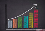
Bar and Column
Bar and column plots are the most common types of data visualization. We see these visual charts everywhere. Research reports, market reports, and analyses are just a few of the many places. It is a quick and easy way to describe the data that you have.
Both column and bar charts show the same data, just that one is vertical while the other is horizontal. Consider using either when it comes to showing changes over a given time period or when you want to answer the question of “how many?”.
Table
A table chart is when data is arranged in rows and columns. This common type of data visualization is often used through data analysis, print media, computer software, object analysis and more.
It is one of the most basic and effective ways to show data. A table can sometimes be overwhelming if you have a dashboard with many metrics that you want to display. It’s important to find a happy medium between large amounts of data and too little data.
Time Series
Time-series data is simply a set of ordered data points concerning time. The analysis comprises different algorithms or methods used to extract certain statistical information and characteristics of data to predict future values based on stored past time-series data.
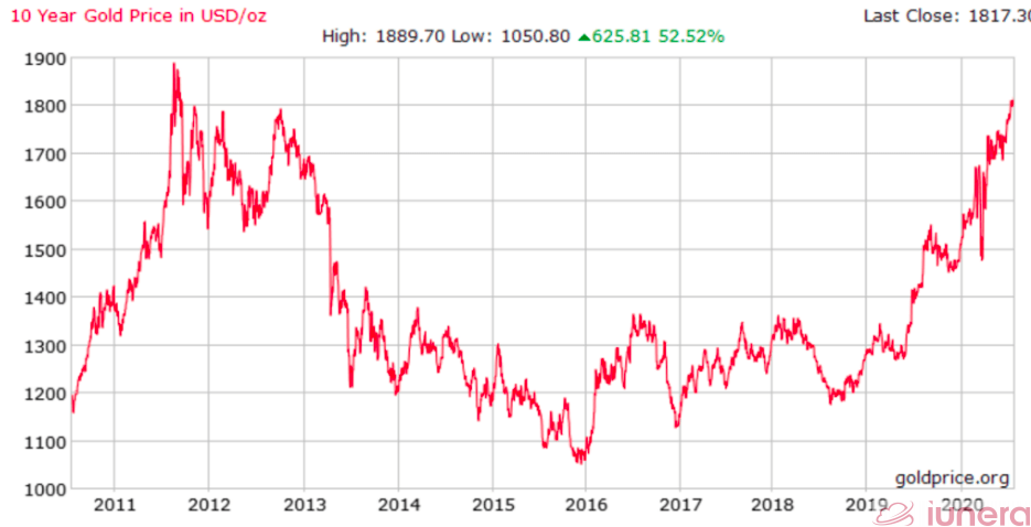
Moreover, time-series data is commonly plotted on a line graph. This is because the individual data points are spaced equally with time; hence time becomes an independent variable concerning the data being investigated. It is presented in that way so that the correlation (if exists) could be visualized easily.
Histograms
The histogram shows a single variable instead of multiple. And, instead of showing trends over time, a histogram shows frequency. An x-axis of a histogram is where the bins or intervals of the variable are and the y-axis is the frequency. Each bar on a histogram represents the frequency of that bin.
Histograms give an estimate as to where values are concentrated, what the extremes are and whether there are any gaps or unusual values throughout your data set.
Box Plots
A box plot, or box and whisker diagram, is a visual representation of displaying a distribution of data, usually across groups, based on a five-number summary: the minimum, first quartile, the median (second quartile), third quartile, and the maximum.
They also show how far the extreme values are from most of the data.
Box plots are a type of graph that can help visually organize data. Once the box plot is graphed, you can display and compare distributions of data.
Pie Charts
This particular chart is very informative and a straight glance. At a high-level, they’re easy to read and understand because the parts-of-a-whole relationship is made very obvious.
Pie charts are very widely used in the business world and the mass media. However, they have been criticised. Many experts recommend avoiding them as research has shown it is difficult to compare different sections of a given pie chart or compare data across various pie charts. Pie charts can be replaced in most cases by other plots such as the bar chart, box plot, dot plot, etc.
Heatmap
A heat map is a data visualization tool that shows the relationship between two measures and provides rating information. The rating information displays the correlation between two measures and helps us to understand the deeper relationship between the data points.
Putting it all together
Data visualization is the communication of data visually. Data visualisation aims to increase the clarity or understanding of data and its patterns, trends, and relationships. Ultimately, it’s an effective and efficient way to organize data and gain instant insights.
Data visualization plots, charts, smooths and weighs data in a visual manner so that anyone can better understand their data and can make decisions based on true facts and figures. A huge benefit of data viz is that it’s highly effective for surfacing abnormalities, inconsistencies or any change in the data. This will allow the stakeholders to understand the data in a single glance without reading into the data too much.
Visualization gives you answers to questions you didn’t know you had.” – Ben Schneiderman
Data visualization isn’t going away any time soon, so it’s important to build a foundation of analysis and storytelling and exploration that you can carry with you regardless of the tools or software you end up using.
When it comes to the industry, some of the biggest names include Microsoft, IBM, SAP and SAS. Some other vendors offer specialized big data visualization software; popular names in this market include Tableau, Qlik and Tibco.
Are you looking for ways to get the best out of your data?
If yes, then let us help you use your data.
Frequently Asked Questions
What is Data Visualization?
Data visualization is the communication of data visually. Data visualisation aims to increase the clarity or understanding of data and its patterns, trends, and relationships.
Why are Data Visualisation important?
Ultimately, it’s an effective and efficient way to organise data and gain instant insights. Data visualisation can deliver visual reporting to users for the performance, operations, general statistics of an application, network, hardware, business operations, financial data, etc.
What are the basic types of Data Visualisation?
The basic types of Data visualisations include table, time-series, histograms, bar plot, heatmap and more.